The truth is though, people do. In the same way we judge a plate of food before we taste it, a house by a front door, a company by a logo. Heck, when out walking my impeccably well-behaved Golden Doodle, Duffy (see The Dog Days of April) I’ll judge a dog from 80 yards by the tilt of its owner’s hat and reroute accordingly.
Who these days has the time to make an informed decision? It’s the same with a book cover. Never mind the five-star reviews, the blurb on the back or even the sizzling first page, your cover is your first hook or your instant sayonara. No pressure then. The problem is having expended a couple of years researching, crafting and editing your novel, as a writer you want to cram all that the book means to you onto the cover. That’s why it’s possibly best left to someone else, someone who knows about visual impact, and about selling.
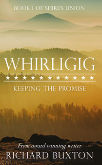
I’m alright though, because I have Lucy Llewellyn to work with. Spread the Word introduced me to Lucy and she runs Heard and Heart publishing as well as being the bee’s knees as a cover designer. When we designed Whirligig, Lucy patiently steered me away from visions of painted battlefields, cannon silhouetted at sunset, or a breathless ante-bellum heroine backed by a burning plantation house. Instead she introduced me to mood boards and invited me to share book covers I admired. We digitally waded through hundreds of photo stock pictures. The result, laboured over by Lucy, was a graded amber to peach progression of ridges fading into the distance. I’ve seen that view so many times while travelling in Appalachia. With little more than that, just a few American stars to clue a passing reader into the possible period, it seemed to magically convey the spirit of the book.
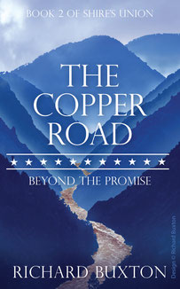
When it came time to design the cover for The Copper Road, the second book in the Shire’s Union trilogy, there was a new challenge. Not only did we need to make the cover stand out and convey the essence of the story, it had to relate to book one. And we struggled. I had some vague, poorly articulated idea (not good in a storyteller) that I wanted the hills to present differently: more menace.
We wasted a couple of weeks looking for an image that had an actual road to go with the title but, funnily enough, it’s tough to find an 1860s road in a photo. What we did find was an image that showed steep-sided hills above a rushing river, much as the valley does that hosts the Copper Road in Polk County, Tennessee. Roads are metaphorical anyway, we reasoned. We experimented with clouds to add to the menace and Lucy put in the hard hours, layering the shading and the mist into the hills, turning the river to copper. The same band of stars links it to book one.
I’m just as happy as the first time around. The cover says, ‘don’t go into the hills,’ or ‘beware all ye who enter here,’ but it’s a story… so they do…and they’re not.
Thanks Lucy.
Write a comment
Gill Thompson (Saturday, 23 February 2019 10:10)
I really love this cover Richard - and the way is connects with the first, albeit, as you say, in a more menacing way. When will I be able to buy the book? x
Tracy Fells (Saturday, 23 February 2019 11:11)
I loved Whirligig's cover but incredibly this is even better. Simply stunning.
Richard Buxton (Thursday, 28 February 2019 08:38)
Hi Gill,
I'm working hard with a new American editor on this so it'll be a little while yet.